Introduction to
Web Design

What is Web Design?
Web design refers to the design of websites. It usually refers to the user experience aspects of website development rather than software development. Web design used to be focused on designing websites for desktop browsers; however, since the mid-2010s, design for mobile and tablet browsers has become ever-increasingly important.
A web designer works on a website's appearance, layout, and, in some cases, content.
- Appearance relates to the colors, typography, and images used.
- Layout refers to how information is structured and categorized. A good web design is easy to use, aesthetically pleasing, and suits the user group and brand of the website.
- A well-designed website is simple and communicates clearly to avoid confusing users. It wins and fosters the target audience's trust, removing as many potential points of user frustration as possible.
What is Responsive Web Design?
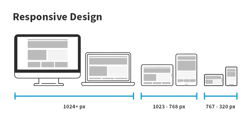
Responsive Web Design (a.k.a. "Responsive" or "Responsive Design") is an approach to designing web content that appears regardless of the resolution governed by the device. It’s typically accomplished with viewport breakpoints (resolution cut-offs for when content scales to that view). The viewports should adjust logically on tablets, phones, and desktops of any resolution.
Responsive designs respond to changes in browser width by adjusting the placement of design elements to fit in the available space. If you open a responsive site on the desktop and change the browser window's size, the content will dynamically rearrange itself to fit the browser window. The site checks for the available space on mobile phones and then presents itself in the ideal arrangement.
What is Adaptive Web Design?
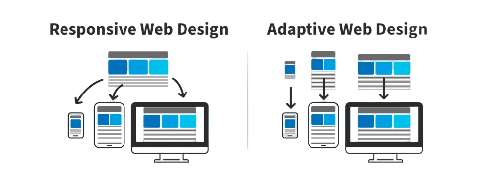
Adaptive design is similar to responsive design—both are approaches for designing across a diverse range of devices; the difference lies in how the tailoring of the content takes place.
In the case of responsive design, all content and functionality are the same for every device. Therefore, a large-screen desktop and smartphone browser displays the same content. The only difference is in the layout of the content.
Adaptive design takes responsiveness up a notch. While responsive design focuses on just the device, adaptive design considers both the device and the user’s context. This means that you can design context-aware experiences—a web application's content and functionality can look and behave very differently from the version served on the desktop.
For example, if an adaptive design detects low bandwidth or the user is on a mobile device instead of a desktop device, it might not load a large image (e.g., an infographic). Instead, it might show a smaller summary version of the infographic.
Another example could be to detect if the device is an older phone with a smaller screen. The website can show larger call-to-action buttons than usual.
“The power of the Web is in its universality.
Access by everyone regardless of disability is an essential aspect.”
—Tim Berners-Lee, W3C Director and inventor of the World Wide Web